Harmony 5.0.0
2U's CSS Styleguide
Core
Introduction
What is Harmony?
Harmony is a malleable and high-level style guide and CSS framework. It provides a baseline of patterns for product designers, developers and web producers to use when building 2U's digital products. This ensures the designs follow accessibility guidelines, are consistent across products, and can be implemented efficiently.
Harmony works in conjunction with our program theming tools Harmony Themes and Whitelabel, which support scaling it across many products and programs.
Versioning
We use SemVer for versioning. For the versions available, see the Harmony releases.
Release Process
Review the Harmony & Whitelabel Service Level Agreement for more information about the release process.
Contributing
The issue tracker is the preferred channel for bug reports and/or enhancement requests. Create an issue and follow the directions described in the contributing guidelines.
Community
For any questions about Harmony, feel free to reach out to us on the #harmony Slack channel.
Using these docs
Components
The Harmony documentation provides a breakdown of the different components in Harmony. Examples are broken down into the following sections:
-
Title/Description - The title/description area provides an overview of the element.
-
Code Snippet - The description is followed by a code snippet with an option to select html or pug.
-
Validation Requirements - Some elements need additional attributes to meet accessibility standards. These attributes will be listed in the validation requirements section. If the validation requirements are not met, a flashing red error will be displayed. Read more about our validation feature.
-
Modifiers - If the element has modifiers, these modifiers will be listed with a visual example. Modifiers are used to change the appearance of an element.
-
States - If the element has states, these states will be listed with a visual example. States are used to change the state of an element, such as setting an element to a fixed position.
Utilities
Elements can be styled using the utility classes. Each utility is prefixed with .u-- so you can easily differentiate them from the rest of the project. Furthermore, utilities contain responsive modifiers, so the styles can update on different breakpoints.
Patterns
The patterns section includes examples of designs created with harmony elements and utility classes.
If you have a pattern that you would like us to add, or have feedback about Harmony/Harmony documentation, let us know! Create a ticket in the issue tracker on Github with a description of what you would like us to update.
Inspect Element
For further details about what styles are being applied, use the inspect element tool. From there, you can view the CSS rules in the style pane, as well as the entire CSS sheet that is being generated by Harmony.
Setup
Designers
For designers, download Harmony's sketch template.
Engineers
If you're an engineer at 2U, you should be using Harmony via Whitelabel. For non-2U developers, you can install Harmony via NPM:
In your package.json add the following line to your dependencies
...
"dependencies": {
    "harmony": "git@github.com:2uinc/harmony.git"
}
...
Then run
$ npm install
If you're interested in developing Harmony, read the README file on Github.
HTML
Harmony provides default styling for all HTML elements. As a base layer, we use normalize.css to render elements consistently across browsers and devices.
| Example | Markup |
|---|---|
|
A string of text |
<p> |
| Link | <a> |
| External link | <a rel="external"> |
| Small | <small> |
| Emphasis! | <em> |
| Strong | <strong> |
|
<ul> |
|
<ol> |
Some quotable |
<blockquote> |
<img src="" alt=""> |
|
|
|
<hr> |
Accessibility
Harmony aims to fulfill WCAG 2.0 (A/AA) standards, but it is dependent on the developer’s markup, styling, and scripting they’ve included. This documentation aims to provide developers with best practice examples to demonstrate appropriate semantic and accessible markup.
Color Contrast
Harmony has color contrast validation to ensure proper contrast levels. For non-harmony colors, use ons of the color contrast checkers available online to ensure that your colors do not fall below the recommended WCAG 2.0 color contrast ratio of 4.5:1.
Conveying Meaning with Color
Color only provides a visual indication, which will not be conveyed to users of assistive technologies. Ensure that information denoted by the color is either obvious from the content itself, or is included as text hidden with the .u--sr-only utility class.
Interactive Elements
Interactive components—such as modals, dropdown menus and tooltips are designed for visual users. Through the use of relevant WAI-ARIA roles and attributes, these components should also be understandable and operable for screen reader users. Each component will list the relevant validation requirements that need to be added.
Visually Hidden Content
Use the .u--sr-only utility class for content that is visually hidden, but should remain accessible to screen readers.
Accessibility Resources
Validation
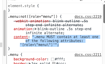
One of the core features of Harmony is its aria-*, role="", and semantic tag validation. Many components within the library have specific requirements that, unless meet, will display a flashing red error like the one seen below.
To learn how to correct the error you can refer to the documentation sections titled "Validation" or inspect the element in your browser's developer tools.
Typography
Harmony's default font size is 1rem which works out to 16px in most browsers. The default line height is set to 1.5 to adhere the global 8px gird. The default typeface is Proxima Nova.
In Harmony 5.0.0, we added new breakpoints and responsive modifiers for the Heading and Display classes. The styles of the responsive classes are added in Whitelabel. If they are left blank, they will default to the non-responsive styles:
--phone-landscape--tablet--tablet-landscape--laptop--monitor
-
phone-landscape-breakpoint: 480px; -
tablet-breakpoint: 768px; -
tablet-landscape-breakpoint: 1024px; -
laptop-breakpoint: 1200px; -
monitor-breakpoint: 1360px;
Display
Display headers and non-semantic classes for styling text. Display text styles are set in Whitelabel and vary by program.
Display 1
Display 2
Display 3
Display 4
Display 5
Display 6
Responsive Display Header Example
<p class="display-1">Display 1</p>
<p class="display-2">Display 2</p>
<p class="display-3">Display 3</p>
<p class="display-4">Display 4</p>
<p class="display-5">Display 5</p>
<p class="display-6">Display 6</p>
<p class="display-3 display-1--tablet">Responsive Display Header Example</p>
p.display-1 Display 1
p.display-2 Display 2
p.display-3 Display 3
p.display-4 Display 4
p.display-5 Display 5
p.display-6 Display 6
p.display-3.display-1--tablet Responsive Display Header ExampleHeading
Headings are text styles that help create hierarchy in a page's content. Their proper usage is essential to creating accessible content. Heading styles are set in Whitelabel and vary by program.
Heading 1
Heading 2
Heading 3
Heading 4
Heading 5
Heading 6
Paragraph with Heading 1 styles
Paragraph with Heading 2 styles
Paragraph with Heading 3 styles
Paragraph with Heading 4 styles
Paragraph with Heading 5 styles
Paragraph with Heading 6 styles
Responsive Heading Example
<h1>Heading 1</h1>
<h2>Heading 2</h2>
<h3>Heading 3</h3>
<h4>Heading 4</h4>
<h5>Heading 5</h5>
<h6>Heading 6</h6>
<p class="heading-1">Paragraph with Heading 1 styles</p>
<p class="heading-2">Paragraph with Heading 2 styles</p>
<p class="heading-3">Paragraph with Heading 3 styles</p>
<p class="heading-4">Paragraph with Heading 4 styles</p>
<p class="heading-5">Paragraph with Heading 5 styles</p>
<p class="heading-6">Paragraph with Heading 6 styles</p>
<h1 class="h3 h1--tablet">Responsive Heading Example</h1>
h1 Heading 1
h2 Heading 2
h3 Heading 3
h4 Heading 4
h5 Heading 5
h6 Heading 6
p.heading-1 Paragraph with Heading 1 styles
p.heading-2 Paragraph with Heading 2 styles
p.heading-3 Paragraph with Heading 3 styles
p.heading-4 Paragraph with Heading 4 styles
p.heading-5 Paragraph with Heading 5 styles
p.heading-6 Paragraph with Heading 6 styles
h1.h3.h1--tablet Responsive Heading ExampleSpecial
There are also some Harmony specific text treatments.
Longform is designed for long form reading.
Lead makes a paragraph stand out.
Small Caps
Some text withCodein it
Lorem ipsum dolor sit amet.
<p class="longform">Longform is designed for long form reading.</p>
<p class="lead">Lead makes a paragraph stand out.</p>
<p class="small-caps">Small Caps</p>
<p>Some text with<span class="code">Code</span>in it</p>
<blockquote class="blockquote">
    <p>Lorem ipsum dolor sit amet.</p>
    <footer>Fancy blockquote</footer>
</blockquote>
p.longform Longform is designed for long form reading.
p.lead Lead makes a paragraph stand out.
p.small-caps Small Caps
p Some text with
span.code Code
| in it
blockquote.blockquote
p Lorem ipsum dolor sit amet.
footer Fancy blockquoteForms
Harmony provides form control styles, width options, and custom components for creating a wide variety of forms.
Checkboxes
Checkboxes are used when there is a list of options and the user may select any number of choices
<fieldset class="form-group">
    <legend class="label" for="">What's your favorite color</legend>
    <div class="checkbox-group">
        <div class="checkbox is--disabled">
            <input class="control" id="favorite-1" disabled="" type="checkbox" name="favorite" checked=""/>
            <label class="label" for="favorite-1">Option disabled</label>
        </div>
        <div class="checkbox">
            <input class="control" id="favorite-2" type="checkbox" name="favorite"/>
            <label class="label" for="favorite-2">Blue</label>
        </div>
        <div class="checkbox">
            <input class="control" id="favorite-3" type="checkbox" name="favorite"/>
            <label class="label" for="favorite-3">Red</label>
        </div>
    </div>
</fieldset>
fieldset.form-group
legend.label(for="") What's your favorite color
.checkbox-group
.checkbox.is--disabled
input#favorite-1.control(disabled="", type="checkbox", name="favorite", checked="")
label.label(for="favorite-1") Option disabled
.checkbox
input#favorite-2.control(type="checkbox", name="favorite")
label.label(for="favorite-2") Blue
.checkbox
input#favorite-3.control(type="checkbox", name="favorite")
label.label(for="favorite-3") RedValidation
| Requirements |
|---|
Checkboxes that are disabled with the |
Modifiers
| Example | Class |
|---|---|
.checkbox-group--inline |
Control Group
Control groups allow you to place elements like buttons and checkboxes in-line with controls.
<div class="control-group">
    <div class="control-group__add-on"><span class="icon icon--calendar" aria-hidden="true"></span></div>
    <input class="control" type="text"/>
</div>
<div class="control-group">
    <input class="control" type="email"/>
    <button class="button control-group__button">Search</button>
</div>
.control-group
.control-group__add-on
span.icon.icon--calendar(aria-hidden="true")
input.control(type="text")
.control-group
input.control(type="email")
button.button.control-group__button SearchControl
Controls, control the UI. It's a class for styling <input>, <textarea>, and <select> consistently.
<input class="control u--margin-bottom-2" type="text" value="Hello world"/>
<input class="control u--margin-bottom-2" type="number" value="10"/>
<select class="control u--margin-bottom-2">
    <option>Select</option>
    <option>Option 1</option>
    <option>Option 2</option>
</select>
<textarea class="control u--margin-bottom-2">Hello world</textarea>
input.control.u--margin-bottom-2(type='text', value='Hello world')
input.control.u--margin-bottom-2(type='number', value='10')
select.control.u--margin-bottom-2
option Select
option Option 1
option Option 2
textarea.control.u--margin-bottom-2 Hello worldValidation
| Requirements |
|---|
The |
Modifiers
| Example | Class |
|---|---|
.control--small |
|
.control--medium |
|
.control--large |
|
.control--invalid |
Form Group
Form groups are compositions of labels, controls, radios, checkboxes, and/or control groups. If you making a form, use form groups.
<div class="form-group">
    <label class="label" for="example-input-1">Email<span class="label__error-message">This field is required</span></label>
    <div class="u--relative">
        <input class="control" id="example-input-1" type="email" required="" aria-describedby="example-help-text"/><span class="form-group__validation-icon" aria-hidden="true"></span>
    </div>
    <div class="form-group__help-text" id="example-help-text">Format: MM-DD-YYYY</div>
</div>
<div class="form-group">
    <label class="label" for="example-input-2">Age<span class="label__error-message">This field is required</span></label>
    <input class="control" id="example-input-2" type="number" required=""/><span class="form-group__validation-icon" aria-hidden="true"></span>
</div>
.form-group
label.label(for="example-input-1") Email
span.label__error-message This field is required
.u--relative
input#example-input-1.control(type="email", required="", aria-describedby="example-help-text")
span.form-group__validation-icon(aria-hidden="true")
#example-help-text.form-group__help-text Format: MM-DD-YYYY
.form-group
label.label(for="example-input-2") Age
span.label__error-message This field is required
input#example-input-2.control(type="number", required="")
span.form-group__validation-icon(aria-hidden="true")Validation
| Requirements |
|---|
The |
Modifiers
| Example | Class |
|---|---|
Format: MM-DD-YYYY
|
.form-group--small |
Format: MM-DD-YYYY
|
.form-group--medium |
Format: MM-DD-YYYY
|
.form-group--large |
States
| Example | Class |
|---|---|
Format: MM-DD-YYYY
|
.is--invalid |
Format: MM-DD-YYYY
|
.is--valid |
Label
Labels describe the .control they accompany.
<label class="label" for="email">Email</label>label.label(for="email") EmailValidation
| Requirements |
|---|
The |
The |
Radio
Radio buttons are an essential element of forms. They are used when there is a list of two or more options that are mutually exclusive and the user must select exactly one choice.
<fieldset class="form-group">
    <legend class="label" for="">Are you cool?</legend>
    <div class="radio-group">
        <div class="radio">
            <input class="control" id="cool-1" type="radio" name="cool" checked=""/>
            <label class="label" for="cool-1">Yes</label>
        </div>
        <div class="radio">
            <input class="control" id="cool-2" type="radio" name="cool"/>
            <label class="label" for="cool-2">No</label>
        </div>
        <div class="radio">
            <input class="control" id="cool-3" type="radio" name="cool"/>
            <label class="label" for="cool-3">Not Sure</label>
        </div>
    </div>
</fieldset>
fieldset.form-group
legend.label(for="") Are you cool?
.radio-group
.radio
input#cool-1.control(type="radio", name="cool", checked="")
label.label(for="cool-1") Yes
.radio
input#cool-2.control(type="radio", name="cool")
label.label(for="cool-2") No
.radio
input#cool-3.control(type="radio", name="cool")
label.label(for="cool-3") Not SureModifiers
| Example | Class |
|---|---|
.radio-group--inline |
Components
Harmony components split the UI into independent, reusable pieces.
Several Harmony components utilize z-index, the CSS property that helps control layout by providing a third axis to arrange content. These higher values are high and specific enough to ideally avoid conflicts.
- $dropdown-z-index: 1000 !default;
- $navbar-z-index: 1000 !default;
- $modal-background-z-index: 1010 !default;
- $alert-z-index: 1020 !default;
- $modal-content-z-index: 1020 !default;
- $tooltip-z-index: 1030 !default;
- $toast-z-index: 1040 !default;
Alert
Alerts are used to provide contextual feedback messages for typical user actions. They can close automatically after a period of time or be closed by the user through an interaction.
Something you should know about
<div class="alert" role="alert">
    <button class="alert__close button button--close"><span class="icon icon--close" aria-hidden="true"></span><span class="u--sr-only">Close Modal</span></button>
    <p>Something you should know about</p>
</div>
.alert(role="alert")
button.alert__close.button.button--close
span(aria-hidden="true").icon.icon--close
span.u--sr-only Close Modal
p Something you should know aboutValidation
| Requirements |
|---|
The |
Modifiers
| Example | Class |
|---|---|
Something you should know about |
.alert--primary |
Something you should know about |
.alert--success |
Something you should know about |
.alert--danger |
Something you should know about |
.alert--caution |
States
| Example | Class |
|---|---|
Something you should know about |
.is--fixed |
Badge
Badges annotate other elements to add additional information or convey state. Badges are often used for emphasizing a numerical characteristic of an object, e.g., the number of unread items in a folder.
<div class="badge">6</div>.badge 6Modifiers
| Example | Class |
|---|---|
6 |
.badge--success |
6 |
.badge--danger |
6 |
.badge--caution |
Box
A box is a flexible and extensible content container. It is similar to cards but without the box-shadow property. The box colors, borders and spacing can be modified with utility classes.
This is a box with a set height of 10rem.
<div class="box" style="height: 10rem;">
    <p>This is a box with a set height of 10rem.</p>
</div>
div.box(style="height: 10rem")
p This is a box with a set height of 10rem.Breadcrumb List
Breadcrumb lists expose the hierarchy in navigation. They allow the user to quickly move between levels in the information architecture.
<ul class="breadcrumb-list">
    <li class="breadcrumb-list__item"><a href="">Courses</a></li>
    <li class="breadcrumb-list__item"><a href="">Bio 101</a></li>
    <li class="breadcrumb-list__item">Grades</li>
</ul>
ul.breadcrumb-list
li.breadcrumb-list__item
a(href="") Courses
li.breadcrumb-list__item
a(href="") Bio 101
li.breadcrumb-list__item GradesButton
Buttons are used as triggers for actions. Depending on the use case, buttons contain a label and/or an icon. Note that the theme colors (e.g. .button--theme-dark) are set in Whitelabel and vary by program.
<button class="button">Hello</button>button.button HelloModifiers
Card
A card is a flexible and extensible content container. The card colors, borders and spacing can be modified with utility classes.
This is a basic card
This is a basic card
<div class="card">
    <div class="card__body">
        <p>This is a basic card</p>
    </div>
    <div class="card__body">
        <p>This is a basic card</p>
    </div>
</div>
.card
.card__body
p This is a basic card
.card__body
p This is a basic cardGrid
Use this responsive grid system to scaffold page layouts. For styling nested elements, use utility layout classes.
<div class="container">
    <div class="grid">
        <div class="cell span-2">
            <div>1</div>
        </div>
        <div class="cell span-4">
            <div style="line-height: 250px;">2</div>
        </div>
        <div class="cell span-6">
            <div class="grid">
                <div class="cell span-6">
                    <div style="line-height: 150px;">3</div>
                </div>
                <div class="cell span-6">
                    <div style="line-height: 100px;">4</div>
                </div>
            </div>
        </div>
    </div>
</div>
.container
.grid
.cell.span-2
div 1
.cell.span-4
div(style="line-height: 250px;") 2
.cell.span-6
.grid
.cell.span-6
div(style="line-height: 150px;") 3
.cell.span-6
div(style="line-height: 100px;") 4Structure
| Class | Example | Usage |
|---|---|---|
.container .container--fluid |
The container is the outer most wrapper for the grid. Generally it should be a direct child of the body or other full with block element. A single page can have multiple container elements stacked on top of each other. You should not nest container elements inside each other and a container element typically shouldn't wrap the entire page. |
|
.grid |
The |
|
.cell.span-* |
Elements within a grid should, at most, add up to 12. Sums greater than 12 will result in the |
|
.push-* .pull-* |
Easily change the order of our built-in grid columns with |
|
.offset-* |
|
|
.grid--justify |
|
|
.grid--align-middle |
Use |
|
.grid--align-bottom |
Use |
|
.grid--reverse |
Lay out flex items in a reverse direction using the |
|
.grid--no-gutter |
Use |
|
Modifiers
| Example | Class |
|---|---|
1
2
3
4
|
.grid--justify |
1
2
3
4
|
.grid--align-middle |
1
2
3
4
|
.grid--align-bottom |
1
2
3
4
|
.grid--reverse |
1
2
3
4
|
.grid--no-gutter |
Icon
These are icons
<span class="icon icon--plus" aria-hidden="true"></span><span class="u--sr-only">Descriptive text replacement</span>span(aria-hidden="true").icon.icon--plus
span.u--sr-only Descriptive text replacementValidation
| Requirements |
|---|
The |
Modifiers
States
| Example | Class |
|---|---|
| Descriptive text replacement | .is--spinning |
Logo
Logos are graphics that represent a brand. The logo classes set brand-adherent clear space and logo sizing. Refer to Whitelabel to see the full list of program logos.
<div class="logo-1 u--pl3"><img src="https://whitelabel-prod.herokuapp.com/cdn/v1/corp-gen/logo-1.png" alt=""/></div>.logo-1.u--pl3
img(src="https://whitelabel-prod.herokuapp.com/cdn/v1/corp-gen/logo-1.png", alt="")Modal
Modals are a UI element that overlays the page and provides a focused UI flow for the user.
<div class="modal-overlay" style="position: relative;">
    <div class="modal" role="dialog">
        <button class="modal__close button button--close"><span class="icon icon--close" aria-hidden="true"></span><span class="u--sr-only">Close Modal</span></button>
        <h1 class="modal__title">Modal Title</h1>
        <div class="modal__body">
            <p>Lorem ipsum dolor sit amet, consectetur adipisicing elit. Itaque libero aliquid animi distinctio quaerat voluptatum minus, quos eos, asperiores reprehenderit, nulla. Hic reprehenderit eveniet enim pariatur, voluptatum quas quibusdam a.</p>
        </div>
        <div class="modal__footer">
            <button class="button">Cancel</button>
            <button class="button button--primary">Submit</button>
        </div>
    </div>
</div>
.modal-overlay(style="position: relative")
.modal(role="dialog")
button.modal__close.button.button--close
span.icon.icon--close(aria-hidden="true")
span.u--sr-only Close Modal
h1.modal__title Modal Title
.modal__body
p
| Lorem ipsum dolor sit amet, consectetur adipisicing elit. Itaque libero aliquid animi distinctio quaerat voluptatum minus, quos eos, asperiores reprehenderit, nulla. Hic reprehenderit eveniet enim pariatur, voluptatum quas quibusdam a.
.modal__footer
button.button Cancel
|
button.button.button--primary SubmitModifiers
| Example | Class |
|---|---|
.modal--large |
|
.modal--success |
|
.modal--danger |
Navbar
Navbars are a composite of links and logos to help the user navigate a site. They will typically be placed at the top of the page.
<header class="navbar">
    <div class="container"><a class="navbar__brand logo-1" href="">Uni</a>
        <ul class="navbar__links">
            <li class="navbar__item is--active"><a href=""><span>Link 1</span></a></li>
            <li class="navbar__item"><a href=""><span>Link 2</span></a></li>
            <li class="navbar__item"><a href=""><span>Link 3</span></a></li>
        </ul>
    </div>
</header>
header.navbar
.container
a.navbar__brand.logo-1(href="") Uni
ul.navbar__links
li.navbar__item.is--active
a(href="")
span Link 1
li.navbar__item
a(href="")
span Link 2
li.navbar__item
a(href="")
span Link 3Modifiers
| Example | Class |
|---|---|
 |
.navbar--logo-1 |
 |
.navbar--logo-2 |
| |
.navbar--logo-mobile |
.navbar--white |
|
.navbar--justify |
|
.navbar--small-caps |
States
| Example | Class |
|---|---|
.is--fixed |
Popover
Popovers provide extra context on another element. Use them when you need more space than a .tooltip provides.
Hola!
You can put almost anything inside of a popover
- Thing 1
- Thing 2
- Thing 3
<div class="popover card">
    <div class="card__body">
        <h3>Hola!</h3>
        <p>You can put almost anything inside of a popover</p>
        <ul>
            <li>Thing 1</li>
            <li>Thing 2</li>
            <li>Thing 3</li>
        </ul>
    </div>
</div>
.popover.card
.card__body
h3 Hola!
p You can put almost anything inside of a popover
ul
li Thing 1
li Thing 2
li Thing 3Modifiers
| Example | Class |
|---|---|
Hola!You can put almost anything inside of a popover
|
.popover--left |
Hola!You can put almost anything inside of a popover
|
.popover--right |
Hola!You can put almost anything inside of a popover
|
.popover--bottom |
Progress Bar
Progress elements convey that the system is loading or processing an action.
<div class="progress"><span class="progress__label">Downloading...</span>
    <div class="progress__max">
        <div class="progress__bar" style="width: 42%;" role="progressbar" aria-valuenow="42" aria-valuemin="0" aria-valuemax="100"></div>
    </div>
</div>
.progress
span.progress__label Downloading...
.progress__max
.progress__bar(style="width: 42%", role="progressbar", aria-valuenow="42", aria-valuemin="0", aria-valuemax="100")Validation
| Requirements |
|---|
The |
The |
The |
The |
States
| Example | Class |
|---|---|
Downloading...
|
.is--loading |
Spinner
Spinner elements convey that the system is loading or processing an action.
<span class="spinner"></span>span.spinnerModifiers
| Example | Class |
|---|---|
.spinner--small |
Tab List
Tabs manage stacked panes of content, giving the users the ability to view only the content pane they are interested in. Each tab button has a corresponding content pane.
<ul class="tab-list">
    <li class="tab-list__item is--active"><a href="">Tab 1</a></li>
    <li class="tab-list__item"><a href="">Tab 2</a></li>
    <li class="tab-list__item"><a href="">Tab 3</a></li>
</ul>
ul.tab-list
li.tab-list__item.is--active
a(href="") Tab 1
li.tab-list__item
a(href="") Tab 2
li.tab-list__item
a(href="") Tab 3Table
Tables are useful when a collection of data requires vertical alignment through columns for quick scanning and discovery of information.
| Heading 1 | Heading 2 | Time |
|---|---|---|
| Data | Data | Data |
| Data | Data | Data |
| Data | Data | Data |
<table class="table table--responsive">
    <caption class="u--sr-only">Table Description</caption>
    <thead>
        <tr>
            <th scope="col">Heading 1</th>
            <th scope="col">Heading 2</th>
            <th scope="col">Time</th>
        </tr>
    </thead>
    <tbody>
        <tr>
            <td data-th="Heading 1">Data</td>
            <td data-th="Heading 2">Data</td>
            <td data-th="Heading 2">Data</td>
        </tr>
        <tr>
            <td data-th="Heading 1">Data</td>
            <td data-th="Heading 2">Data</td>
            <td data-th="Heading 2">Data</td>
        </tr>
        <tr>
            <td data-th="Heading 1">Data</td>
            <td data-th="Heading 2">Data</td>
            <td data-th="Heading 2">Data</td>
        </tr>
    </tbody>
</table>
table.table.table--responsive
caption.u--sr-only Table Description
thead
tr
th(scope='col') Heading 1
th(scope='col') Heading 2
th(scope='col') Time
tbody
tr
td(data-th='Heading 1') Data
td(data-th='Heading 2') Data
td(data-th='Heading 2') Data
tr
td(data-th='Heading 1') Data
td(data-th='Heading 2') Data
td(data-th='Heading 2') Data
tr
td(data-th='Heading 1') Data
td(data-th='Heading 2') Data
td(data-th='Heading 2') DataValidation
| Requirements |
|---|
The |
For responsive tables, the |
A |
Modifiers
| Example | Class | ||||||||||||
|---|---|---|---|---|---|---|---|---|---|---|---|---|---|
|
.table--bordered |
||||||||||||
|
.table--hover |
||||||||||||
|
.table--responsive |
||||||||||||
|
.table--layout-fixed |
||||||||||||
|
.table--clickable |
||||||||||||
|
.table--theme-dark |
Toast
Toast notifications notify the user of a system occurrence. The notifications should have a consistent location in each application.
<div class="toast" role="alert" style="position: static; display: inline-block;">Something happened!</div>.toast(role="alert", style="position: static; display: inline-block;") Something happened!Validation
| Requirements |
|---|
The |
Modifiers
| Example | Class |
|---|---|
Something happened! |
.toast--success |
Something happened! |
.toast--danger |
Tooltip
Tooltips provide useful information on hover.
<button class="button tooltip tooltip--top" aria-label="Hello world!">Tooltip appears on hover</button>button.button.tooltip.tooltip--top(aria-label="Hello world!") Tooltip appears on hoverValidation
| Requirements |
|---|
The |
Modifiers
States
| Example | Class |
|---|---|
.is--sticky |
Utilities
Utility classes help you quickly style pages without writing custom CSS. Each utility typically adds one specific CSS style and has a descriptive name. When put together with other utilities and Harmony components you can create an infinite number of designs while still staying true to Harmony's aesthetic.
Each utility is prefixed with .u-- so you can easily differentiate them from the rest of the project. Additionally, each utility is mobile-first responsive. You can activate a utility as a certain breakpoint by adding one of the responsive modifiers:
--phone-landscape--tablet--tablet-landscape--laptop--monitor
-
phone-landscape-breakpoint: 480px; -
tablet-breakpoint: 768px; -
tablet-landscape-breakpoint: 1024px; -
laptop-breakpoint: 1200px; -
monitor-breakpoint: 1360px;
We were heavily inspired by Tachyions and Basscss for this part of the framework.
Borders
Use border utilities to quickly style the border and border-radius of an element.
<div class="u--border"></div>
<div class="u--border-thick"></div>
<div class="u--border-top"></div>
<div class="u--border-bottom"></div>
<div class="u--border-left"></div>
<div class="u--border-right"></div>
<div class="u--border u--border-width-thick"></div>
<div class="u--border u--border-0"></div>
<div class="u--border u--border-left-0"></div>
<div class="u--border u--border-right-0"></div>
<div class="u--border u--border-top-0"></div>
<div class="u--border u--border-bottom-0"></div>
<div class="u--border u--border-radius-circle"></div>
<div class="u--border u--border-radius-rounded"></div>
<div class="u--border u--border-radius-rounded-top"></div>
<div class="u--border u--border-radius-rounded-right"></div>
<div class="u--border u--border-radius-rounded-bottom"></div>
<div class="u--border u--border-radius-rounded-left"></div>
<div class="u--border u--border-radius-0"></div>
<div class="u--border u--border-color-primary"></div>
<div class="u--border u--on-hover-border-color-primary"></div>
.u--border
.u--border-thick
.u--border-top
.u--border-bottom
.u--border-left
.u--border-right
.u--border.u--border-width-thick
.u--border.u--border-0
.u--border.u--border-left-0
.u--border.u--border-right-0
.u--border.u--border-top-0
.u--border.u--border-bottom-0
.u--border.u--border-radius-circle
.u--border.u--border-radius-rounded
.u--border.u--border-radius-rounded-top
.u--border.u--border-radius-rounded-right
.u--border.u--border-radius-rounded-bottom
.u--border.u--border-radius-rounded-left
.u--border.u--border-radius-0
.u--border.u--border-color-primary
.u--border.u--on-hover-border-color-primaryBox Shadow
Box shadow is used to add shadow effects around an element's frame.
<div class="box u--box-shadow"></div>
<div class="box u--box-shadow-hover"></div>
.box.u--box-shadow
.box.u--box-shadow-hoverColors
Harmony comes with specially tuned colors that are designed with their own semantic meaning. In addition, Harmony provides default theme colors, which are updated in Whitelabel and vary by program.
| Name | Color Examples | Description | Classes |
|---|---|---|---|
primary |
Text Text on hover |
The primary color is used only on interactive elements. It denotes that this element is the "primary" action in the UI. There should typically be one primary action per view. Color is set to#1673cd. |
|
success |
Text Text on hover |
On static elements, such as alerts, the success color is used to denote that a previous interaction has been successful. On interactive element, such as buttons, the success color is used to denote that interacting with this element will result in the creation of a new object or that the user will be "successful" in their task if they interact with the element. Color is set to#080. |
|
danger |
Text Text on hover |
On static elements, the danger color is used to denote danger, warning, or error to the user. On interactive elements, such as buttons, the danger color denotes that that interacting with this element will result in a destructive action. Color is set to#d12c1a. |
|
theme-dark |
Text Text on hover |
Color is set in Whitelabel and varies by program. The dark theme color will always contrast accessibly with#ffffff. |
|
theme-light |
Text Text on hover |
Color is set in Whitelabel and varies by program. The light theme color will always contrast accessibly with #282828. |
|
theme-cta |
Text Text on hover |
Color is set in Whitelabel and varies by program. This color is purely decorative and has no accessibility requirements. |
|
theme-accent |
Text Text on hover |
Color is set in Whitelabel and varies by program. This color is purely decorative and has no accessibility requirements. |
|
color-dark |
Text Text on hover |
Sets color to#282828. |
|
color-light |
Text Text on hover |
Sets color to#fff. |
|
color-gray |
Text Text on hover |
Sets color to#737373. |
|
color-default |
Text Text on hover |
Sets color to#f9f9f9. |
|
color-hover |
Text Text on hover |
Sets color to#f2f2f2. |
|
color-active |
Text Text on active |
Sets color to#e6f1fc. |
|
color-interaction |
Text Text on interaction |
Sets color to#ffcf37. |
|
Column
Create 2 to 5 columns with the column utility classes.
Lorem ipsum dolor sit amet, consectetur adipisicing elit
Ut enim ad minim veniam, quis nostrud exercitation ullamco
Duis aute irure dolor in reprehenderit in voluptate velit
<div class="u--column-3">
    <p>Lorem ipsum dolor sit amet, consectetur adipisicing elit</p>
    <p>Ut enim ad minim veniam, quis nostrud exercitation ullamco</p>
    <p>Duis aute irure dolor in reprehenderit in voluptate velit</p>
</div>
.u--column-3
p Lorem ipsum dolor sit amet, consectetur adipisicing elit
p Ut enim ad minim veniam, quis nostrud exercitation ullamco
p Duis aute irure dolor in reprehenderit in voluptate velitDisplay Property
Change the value of the display property.
<div class="box u--background-primary u--show-inline-block">Inline-Block</div>
<div class="box u--background-primary u--show-inline">Display Inline</div>
<div class="box u--background-primary u--show-block">Display Block</div>
<div class="box u--background-primary u--hide">Display None</div>
.box.u--background-primary.u--show-inline-block Inline-Block
.box.u--background-primary.u--show-inline Display Inline
.box.u--background-primary.u--show-block Display Block
.box.u--background-primary.u--hide Display NoneFlex
Enable flex behaviors with flexbox utility classes. Resources - MDN's CSS Flexible Box Layout or CSS Trick's A Complete Guide to Flexbox.
Flexbox container
Add the `.u--show-flex` or `.u--show-inline-flex` class to make a flexbox container and transform direct children elements into flex items.
Flex Direction
Flex Direction establishes the main-axis, thus defining the direction flex items are placed in the flex container. Add the .u--flex-row and/or .u--flex-row-reverse classes to line up the items in a horizontal direction or .u--flex-column and/or .u--flex-column-reverse to stack the items in a vertical direction.
Justify Content
Change the alignment of flex items on the main axis (the x-axis to start, y-axis if flex-direction: column). Choose from .u--justify-start (browser default), .u--justify-end, .u--justify-center, .u--justify-space-between, or .u--justify-space-around.
Align items
Change the alignment of flex items on the cross axis (the y-axis to start, x-axis if flex-direction: column). Choose from .u--align-items-start, .u--align-items-end, .u--align-items-center, .u--align-items-baseline, or .u--align-items-stretch.
Align Self
The align-self property overrides the align-items value and should be applied to the individual item. If any of the item's cross-axis margin is set to auto, then align-self is ignored. Choose from .u--align-self-start, .u--align-self-end, .u--align-self-center, .u--align-self-baseline, or .u--align-self-stretch.
Align Content
This aligns a flex container's lines within when there is extra space in the cross-axis, similar to how justify-content aligns individual items within the main-axis. Note: this property has no effect when there is only one line of flex items. Choose from .u--align-content-start, .u--align-content-end, .u--align-content-center, .u--align-content-space-around,.u--align-content-space-between, or .u--align-content-stretch.
Flex Wrap
By default, flex items will all try to fit onto one line. You can change that and allow the items to wrap as needed with this property. Choose from .u--flex-wrap, .u--flex-no-wrap, or .u--flex-wrap-reverse.
Margin Auto
Use .u--flex-right or .u--flex-right to move the item to the left or the right side of the container.
Float
Float an element to the left or right.
The above floats are cleared
<div class="u--clearfix">
    <div class="box u--background-primary u--pull-right">Float Right</div>
    <div class="box u--background-primary u--pull-left">Float Left</div>
</div>
<p>The above floats are cleared</p>
div.u--clearfix
.box.u--background-primary.u--pull-right Float Right
.box.u--background-primary.u--pull-left Float Left
p The above floats are clearedLists
These are some ways you can customize the ul or ol element
- Item 1
- Item 2
- Item 3
- Item 1
- Item 2
- Item 3
- Item 1
- Item 2
- Item 3
- Item 1
- Item 2
- Item 3
<ul class="u--list-inline">
    <li>Item 1</li>
    <li>Item 2</li>
    <li>Item 3</li>
</ul>
<ul class="u--list-inline-dots">
    <li>Item 1</li>
    <li>Item 2</li>
    <li>Item 3</li>
</ul>
<ul class="u--list-inline-pipes">
    <li>Item 1</li>
    <li>Item 2</li>
    <li>Item 3</li>
</ul>
<ul class="u--list-unstyled">
    <li>Item 1</li>
    <li>Item 2</li>
    <li>Item 3</li>
</ul>
ul.u--list-inline
li Item 1
li Item 2
li Item 3
ul.u--list-inline-dots
li Item 1
li Item 2
li Item 3
ul.u--list-inline-pipes
li Item 1
li Item 2
li Item 3
ul.u--list-unstyled
li Item 1
li Item 2
li Item 3Position
Configure the position of an element.
- .u--relative
- .u--fixed
- .u--absolute
- .u--sticky
Screenreader
Hide an element to all devices except screen readers.
This text is only visible to people using screen readers
<p class="u--sr-only">This text is only visible to people using screen readers</p>p.u--sr-only This text is only visible to people using screen readersScroll
Scroll utility classes.
- .u--scrollbar
- .u--no-scroll
<div>
    <ul>
        <li><span class="code">.u--scrollbar</span></li>
        <li><span class="code">.u--no-scroll</span></li>
    </ul>
</div>
div
ul
li
span.code .u--scrollbar
li
span.code .u--no-scrollSpacing
The spacing utilities help you layout project on the 8px grid. Each class has a modifier that ranges from 0 to 8, with each number being a multiplier on the 8px grid. At 0 it will set the corresponding attribute to 0. At 8 it'll set it to 8px * 8 = 64px (4rem). For the sake of space we won't document each increment, but you get the idea.
Padding All Sides
Padding Top
Padding Bottom
Padding Left
Padding Right
Margin All Sides
Margin Top
Margin Bottom
Margin Left
Margin Right
Line Height
<p class="u--padding-4">Padding All Sides</p>
<p class="u--padding-top-4">Padding Top</p>
<p class="u--padding-bottom-4">Padding Bottom</p>
<p class="u--padding-left-4">Padding Left</p>
<p class="u--padding-right-4">Padding Right</p>
<p class="u--margin-4">Margin All Sides</p>
<p class="u--margin-top-4">Margin Top</p>
<p class="u--margin-bottom-4">Margin Bottom</p>
<p class="u--margin-left-4">Margin Left</p>
<p class="u--margin-right-4">Margin Right</p>
<p class="u--line-height-4">Line Height</p>
p.u--padding-4 Padding All Sides
p.u--padding-top-4 Padding Top
p.u--padding-bottom-4 Padding Bottom
p.u--padding-left-4 Padding Left
p.u--padding-right-4 Padding Right
p.u--margin-4 Margin All Sides
p.u--margin-top-4 Margin Top
p.u--margin-bottom-4 Margin Bottom
p.u--margin-left-4 Margin Left
p.u--margin-right-4 Margin Right
p.u--line-height-4 Line HeightText
Text utilities to control alignment, size, weight, and more.
Smallest Text Size
Small Text Size
Normal Text Size
Bold Text Weight
Normal Text Weight
Text that gets cut off with ellipsis Lorem ipsum dolor sit amet, consectetur adipisicing elit. Pariatur eligendi voluptate illo eius quidem reiciendis quae cupiditate ratione nam! Neque facilis assumenda incidunt aliquid placeat corporis quae totam numquam a!
<p class="u--font-size-075">Smallest Text Size</p>
<p class="u--font-size-0875">Small Text Size</p>
<p class="u--font-size-1">Normal Text Size</p>
<p class="u--font-weight-700">Bold Text Weight</p>
<p class="u--font-weight-400">Normal Text Weight</p>
<p class="u--ellipsis" style="width: 320px;">Text that gets cut off with ellipsis Lorem ipsum dolor sit amet, consectetur adipisicing elit. Pariatur eligendi voluptate illo eius quidem reiciendis quae cupiditate ratione nam! Neque facilis assumenda incidunt aliquid placeat corporis quae totam numquam a!</p>
<div class="u--align-left">Text Align Left</div>
<div class="u--align-center">Text Align Center</div>
<div class="u--align-right">Text Align Right</div>
p.u--font-size-075 Smallest Text Size
p.u--font-size-0875 Small Text Size
p.u--font-size-1 Normal Text Size
p.u--font-weight-700 Bold Text Weight
p.u--font-weight-400 Normal Text Weight
p.u--ellipsis(style="width: 320px;") Text that gets cut off with ellipsis Lorem ipsum dolor sit amet, consectetur adipisicing elit. Pariatur eligendi voluptate illo eius quidem reiciendis quae cupiditate ratione nam! Neque facilis assumenda incidunt aliquid placeat corporis quae totam numquam a!
.u--align-left Text Align Left
.u--align-center Text Align Center
.u--align-right Text Align RightVisibility
Control the visibility, without modifying the display of elements.
<div class="box u--background-primary u--visible">Visible</div>
<div class="box u--background-primary u--invisible">Invisible</div>
.box.u--background-primary.u--visible Visible
.box.u--background-primary.u--invisible InvisibleDebug Grid
The debug utility class allows you to put a background grid on any element which can help you line elements up.
<div class="u--debug u--padding-4">The debug utility adds an 8px grid to the background of any block element.</div>.u--debug.u--padding-4 The debug utility adds an 8px grid to the background of any block element.Patterns
Card with Alert
Two different approaches for adding alerts on top of cards. Use option one for smaller cards (such as modals) and option two for larger layout card elements.
Card with Breadcrumb List
A simple way to add wayfinding to card-heavy user flows.
Card with Table
Similar to cards with alerts, tables can be expanded to fill the card area for better visual clarity and use of space.
Card with Tabs
A simple pattern for hiding and showing information in a single card.
Confirmation Modal
A pattern showcasing how to accessibily open and close a modal dialog.
Form Validation
This example shows how to both use Harmony's form vailidation classes, as well as properly manage client focus to address accessibility concerns.